Part 2:Understanding Shadow and Highlight Detail
In this third part of the series on photographic exposure, we deal with understanding tonal contrast. Strictly speaking contrast is not exactly about exposure, but it is very closely related. In this topic we specifically discuss tonal contrast and leave out color contrast or lighting contrast. So what do we mean by tonal contrast?

I showed the above pictures to different kids and all of them said they liked the picture with the darker pentagon. They intuitively thought that they were supposed to see the pentagon and so the picture where the pentagon stood out was better to them. They were not supposed to explain that it the tonal contrast between the shape and the background that helps to see the pentagon better. As photographers we use tonal contrast as one way to make the subject stand out from the background.
Again we take help of the zone system and the black and white image to further develop the concept.

In a properly exposed black and white shot from a typical scene and with normal contrast you should be able to identify all the zones. Each zone represents a tone or a different grey. At higher contrast we have fewer tones and at lower contrast we have more tones. But how does this happen?


At lower contrast the Zone 0 or Zone X may be absent meaning there may not be a region which is totally dark or totally white. The black tends to appear a dark grey and the white loses its brilliance. However you can identify a larger number of mid-tones although the adjacent mid-tones will not be so distinguishable and will appear to blend into each other.
So how do you see an image that has wrong contrast differently from an image that has wrong exposure? Find out by playing with the contrast and brightness settings of an image. While you are doing it, know that some subjects require low contrast and some subjects requires high contrast. But that is a separate topic.
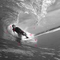
Tonal contrast plays a big role in isolating visual elements in an image, as you can see: the dark suit of the surfer standing out from the lighter tone of the surf and the sky. In the picture with lower contrast, the tone of the shirt is closer to that of the surf and so it does not stand out as much. Kind of like the pentagon in the first picture.
In the film days, it was very difficult to manage the contrast in the print if the image was overexposed or underexposed. You would have a poor print if it not have the level of contrast the image required i.e. if it not have the exposure the image required. In the digital age, you have RAW editing to save the day for you. But you do want to have the absolute best exposure you can have for an image so controlling contrast in the post processing becomes easy. And so you will spend less time doing local adjustments on an image. After all, who wants to spend hours in post processing?