Photographic composition with Color Contrast
We take color for granted. It is everywhere and it is impossible to imagine our world without color. It has been a key visual element for photographers ever since Kodacolor film came out. Modern lenses and cameras render color with incredible clarity. Yet it is on the photographer to figure out how to use those tools to create a composition where color takes the center stage.
To get started, we have to go back to the color wheel that we probably remember since school.

This post is about photographic composition with color contrast. Colors that are on the opposite sides of the color wheel are in maximum contrast to each other – such as red and green or orange and blue. Using color contrast means to create a composition where the contrast between such opposing colors become the dominant element.

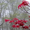
This picture from my backyard uses the contrast between red and green. The red azalea buds stand out so well party because the background is blurred and partly because the background is green. The contrast between the buds and the fresh green leaves works very well too. The soft sidelight makes the buds appear three dimensional and picks out the single strand of cobweb.

In this photo of my older son when he was about 3, I used the contrast between blue and yellow. If you noticed, these two colors are not quite opposite in the color wheel but that does not matter. You can use any 2 colors that are somewhat apart to make a play with contrast. One key thing to remember is that you cannot introduce a third dominant color. I had to be careful to exclude any other people or objects in the frame.
Photographic composition with color contrast works best when there are only 2 colors. However, white or black can be included as a third color to complement the dominant pair. If you could imagine him wearing a colored vest instead of white, the contrast between yellow and blue would not be so attractive.