We see things in color. It is the most natural thing we can think of. Photographically speaking, however, there are different ways of handling color. So here are my 8 Tips on how to use color in photographic composition. The following possibilities exist on how we can use color in a photograph:
- Color contrast
- Color harmony
- Muted color vs. saturated color
- Accent color
- Color and Mood
- Color and Rhythm
- Color and Exposure
- Color and Light
I will explain how to use color in photographic composition, with examples so the list given above makes sense. Often I will refer to the color wheel, which many of us might have learned about at school.


Color Contrast
Case when we predominantly use a pair of colors which are apart from each other in the color wheel. Red azalea buds and the little green leaves are directly opposite in the color wheel. Read more here.
Color Harmony
Case when colors close to each other in the color wheel is used to compose a picture such as in the portrait of the bride.
Saturated vs. Muted Color
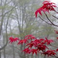
Colors fade when seen through mist or smoke depending on the distance. Last week as I was leaving for work in the morning, I saw the newly leafing Shin Deshojo Japanese Maple in my backyard in the background of the trees shrouded in mist.
Accent Color
The bright yellow flowers create the accent in the monochromatic background of dry earth and eroded rocks seen along the Scenic Drive at the Capitol Reef National Park.
Color and Mood
Warm colors create a happy mood while cooler colors create a sad mood. The almost monochromatic and bluish hues create an inhospitable mood in this picture of Mammoth Springs in Yellowstone National Park. The mood created by the vibrant colors of the tulips at the Madison Square Park on a gorgeous spring day is just the opposite.
Color and Exposure
Exposure can be changed to change the impact that color has on a picture. Photographers using slide film often underexposure by 1/2 stop to increase the color saturation. A larger degree of underexposure than alter the mood of a picture as in the case of the Weeping Atlas Cedar shown below. I underexposed to bring out the bristling needles that the early morning light picked out. Some color fidelity and detail has been lost but the highlight exposure brings out a key characteristic of the tree. Deliberate overexposure on the other hand can create muted colors.
Color and Light
Backlight or contre jour lighting creates opportunities of fascinating pictures, if the lens glare can be managed. This light really brings out the fidelity in the color as you can see in the backlit leaves of the Fireglow Japanese Maple. Another example is the picture of the iridescent magenta flowers in the mid-day sun, standing out against the darker background.
Color and Rhythm
Similar colors seen in different visual elements can create an interesting frame like repeating lines create a rhythmic pattern – as in the case of the blue hyacinth and blue jeans.
Color has endless possibilities. But it is easy to lose an opportunity in a clash of colors that do not work together. Hopefully this post will give you a framework to imagine and explore color in photographic composition.